Key Takeaways:
- The user should be able to access the healthcare app and its content in the minimum possible time.
- Use the screen space and time wisely when your healthcare app is loading. A splash screen gives you a short but vital window to engage a user in your proposition.
- Users expect to be corrected if they make a typo or spell a word wrong. It’s crucial to make suggestions as to what you think your users meant to search for.
- A visual calendar will work wonders for patient appointment booking applications. Providers can navigate easily through the weekly appointments, and make changes if needed.
- Make sure that any information that a user fills out doesn’t get erased when they get an error message on submission.
Did you know that in the third quarter of 2023, the user retention rate for health and fitness apps was found to be 2.8 percent after 30 days of app installation?
There are several reasons for minimal user retention. These include slow operations, lack of updates, bugs, and unwanted features. One of the key aspects that drive user retention is the UX (User Experience). It is the look and the feel of the healthcare application that ultimately attracts a user.
As per Forrester, on average, every dollar invested in UX brings $100 in return. That’s an ROI of a whopping 9,900%.
So, it is established having a great user experience is important. Healthcare apps must have come a long way, but the importance of a great UI and UX together play the game.
A great user experience is a mix of good design, development, and understanding of users. Given 15 minutes to consume content, two-thirds of people would rather read something beautifully designed than something plain.

True, organic growth is all about giving your users the best experience possible. So, in order to help you create happy users, we’ve put together quick fixes for common usability issues.
Dedicate 5 minutes to fixing each one and improve the UX for your healthcare app:
User Experience Fix #1: Shorter Time to Value (TtV)

A healthcare app taking a long time to load!
Too bad!
You hate this, your users hate this too! According to a study, in 2023, the average bounce rate for healthcare websites stood at 58.29 percent.
Time to Value or TtV is a business term that describes the period of time between a request for a specific value and the initial delivery of the value requested.
So, in terms of healthcare mobile apps, the user should be able to access the app and its content in the minimum possible time.
Unlike web users, mobile users aren’t looking to explore your development company. They download apps because each one helps them reach a specific goal and perform a very specific task.
Get to that task, ASAP!
So, if you are an Uber, I want you to help me reach from point A to B. Here’s how the first screen looks like, the TtV is bang on:
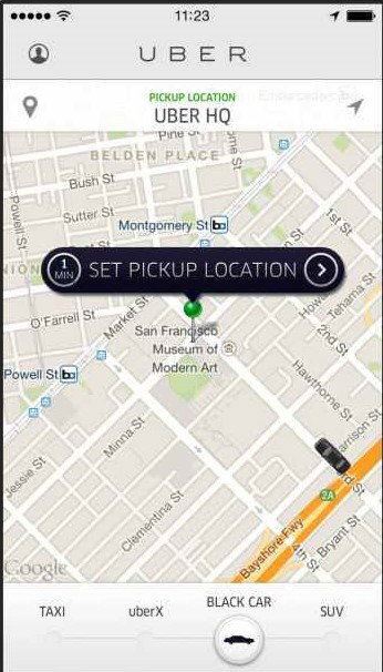
No jazz, no build-up, get users started in minimum possible time.
If you want to onboard the first-time users, use minimum possible steps and explain the functionality.
In fact, the first-time user experience (FTUE)—is tied to key app success metrics like retention and can boost the lifetime value of a user by up to 500%.
So, for users looking for specific healthcare app services, such as prescription refilling, you design a UX that instantly transports the user to the ‘order medicine’ page.
User Experience Fix #2: Don’t request a sign-up until you absolutely need it
Break that sign-up wall and go beyond it. Not every healthcare app needs a sign-up. For instance, fitness apps, meditation apps, and diet and nutrition apps.
We know that you’ll say having a sign-up helps you personalize the user experience. But, consider the fact that many users move away because of the unnecessary sign-up requirements.
Here’s the scenario, the user downloads the healthcare app, opens it, and then gets stuck at a ‘sign-up or log in’ screen. If it is an unwanted feature, trust me, those users are never coming back.
If feasible, give them an option to explore the app as a guest, with certain features locked for only members. If they are pleased, they will take the effort to sign-up.

But if your healthcare app enables a user to log in, ensure you provide the benefit of a high level of convenience and personalization, derived from their details, behaviors, and transaction history.
User Experience Fix #3: Use splash screens for tips/onboarding
Never make users wait.
Use the screen space and time wisely when your healthcare app is loading.
A splash screen gives you a short but vital window to engage a user in your proposition. Provide them vital tips/help in context of the mHealth app’s functionality. Or add app’s logo and tag line, with high-color contrast to keep users engaged for a short while.
Most experts say an onboarding sequence should only be employed if absolutely necessary. Otherwise, you can use splash screens to provide the absolutely vital information.
User Experience Fix #4: Fix spellings or grammar errors and recommending what users meant to search
Users are using your search function as their main point of navigation. So, it is absolutely vital to have a search box on every page of your healthcare app.
But let’s be honest, when was the last time you typed something into Google and thought I am 100% sure that’s how it is spelt or what I meant?
Not many times? That’s why Google suggests or even corrects you with the right keywords.
Users expect to be corrected if they make a typo or spell a word wrong. It’s crucial to make suggestions as to what you think your users meant to search for.
See how Amazon app suggested me the right keywords when I made a typo:
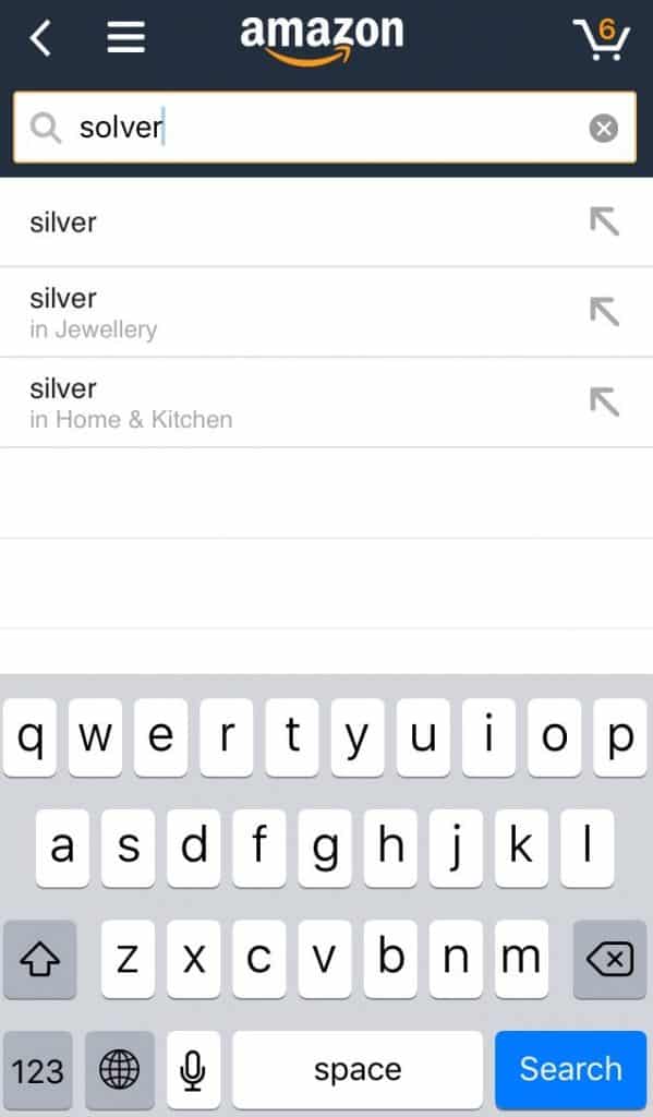
Unlike ‘silver’ here, medical terms and terminologies aren’t easily comprehended by a common man, so there are high chances of typos. Help people out by fixing spelling errors and recommending what they meant to search. Display the results for closely related words, and inform them that results are being displayed for these terms instead.
User Experience Fix #5: Display sample content for first-time users
The first-time user will obviously have no data in the healthcare app.
But instead of showing blank screens, make it more realistic by designing sample content for that space (even if it’s just Lorem Ipsum sample text).
This will have two benefits:
- Another way of user onboarding, teaching the user in a subtle manner how the healthcare app can be used
- Increase retention by leading user to the next step instead of aborting the healthcare app.
See how Dropbox displays some sample pictures for the users with no data:

User Experience Fix #6: Use visual calendars instead of manual dates
Users hate long forms where you ask them for tons of information. They are tedious and boring.
So, make this step as easy as possible.
Most of the sign-ups require date of birth. So, instead of asking users to manually enter the dates, use visual calendars instead. Something like iPhone’s calendar:
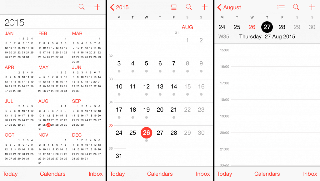
A visual calendar will work wonders for patient appointment booking applications. Providers can navigate easily through the weekly appointments, and make changes if needed. The same goes for patients who are looking for a calendar with enhanced details such as time, date, day, and week. You can refer to Google Calendar for inspiration.
Pro-tip: The default year on your visual calendar should be closest to your target user’s birth year. For example: If the target user group for your app are millennials so keep the default year as 1990, so the user has to scroll minimum to save time.
User Experience Fix #7: Show progress bars for long forms
Every healthcare app comes with an intake form, which is later used for medical consultations. Users may not like lengthy forms. So, one way to make these forms less-taxing is to show the progress bar.
For forms that are longer than a single screen, it’s good to show users a progress bar indicating how far they’ve come, and more importantly, how close they are to finishing the form.
User Experience Fix #8: Instead of just displaying data, show transitions
When a user moves from one screen to another, they shouldn’t feel ‘Where that came from?’
To avoid surprising users with a different interface use transitions between the screens instead of direct data pop-ups.
User Experience Fix #9: Save form content if the user makes an error
One more point on forms? Yes, because it is absolutely necessary!
Even if your forms are the cleanest and most simple forms around, filling out forms still sucks.
Let’s establish that.
But what turns off a user more is if the form clears out all the typed information because of an error!
For instance: A user spent 3 minutes filling out all details like email, contact, password, etc. but made an error. Let’s say the email address was not correct. But when the page reloads all the other information is also gone!
That’s like a super fail.
Unless the user really wants to use your healthcare app, they will be too frustrated to fill out everything again and will just leave.
Make sure that any information that a user fills out doesn’t get erased when they get an error message on submission.
User Experience Fix #10: Use placeholder text in fields
As a user, I don’t want to get stuck or confused about whatever information you’re asking me.
So, a big help here would be to simply enter placeholder text in the empty fields and instruct users what is expected from them.
Something like this:
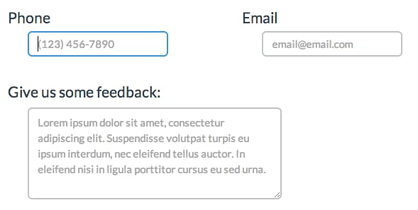
For example, phone numbers can be written in a variety of formats. They could include brackets around the area code or the country code before the area code. make sure you use placeholder text in such fields to avoid errors.
Final words
Good UX is good business. So, create great user experience for your healthcare apps and reap its maximum benefits. To improve the UX of an existing app you should first conduct a usability assessment of your app.
Now, if you don’t know how to go about building a great healthcare UX for your app, then just partner with the experts in the field, like US – Arkenea, a top-notch healthcare software development company. We have over 13 years of experience in the healthcare domain and are well acquainted with nitty gritty of mobile healthcare app development. Just hop on to a consultation call with us and we’ll assist you.
